Tips for Using Fabric Value, Scale, and Placement in Quilt Design
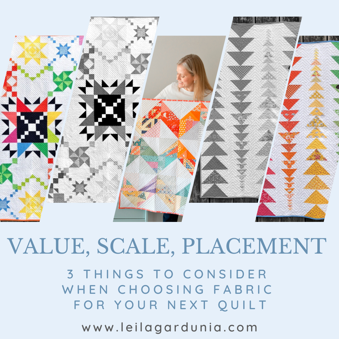
Three things I pay attention to when choosing fabrics for my quilt are value, scale, and placement. Paying attention to these things can elevate any quilt design and create a visually appealing quilt.
Let me preface this by saying that there is a fine line between overthinking fabric choice and placement and taking time to make good design choices. I once spent 3 hours rearranging blocks for my Skill Builder Sampler - an example of totally over-thinking it. I could have stopped after one hour of rearranging blocks and it would have looked just fine. However, taking a reasonable amount of time and paying attention to fabric choice and placement throughout the planning and construction process can make a huge difference in your quilt’s final outcome. Color choice and placement can turn a ‘nice’ quilt into a stunning beauty.
Let's talk about value, scale, and placement and how to use them effectively. I’ll use the Quilty Chick BOM pattern I am currently working on and other quilts I have made in the past as examples.
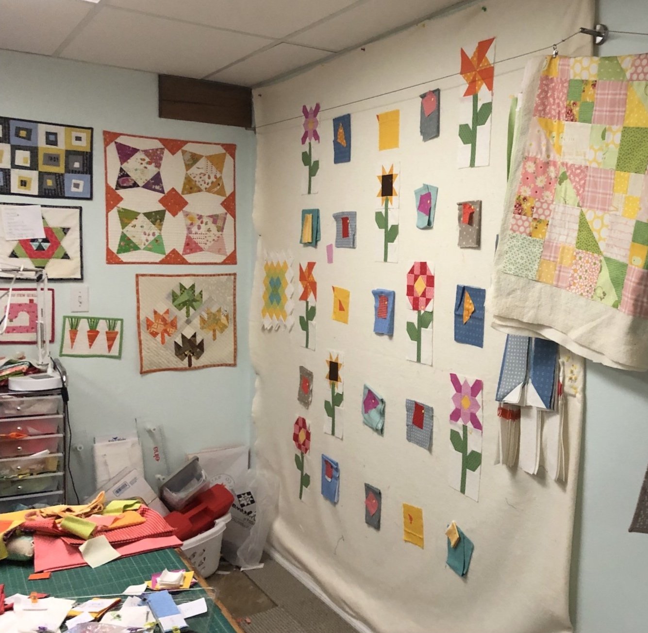
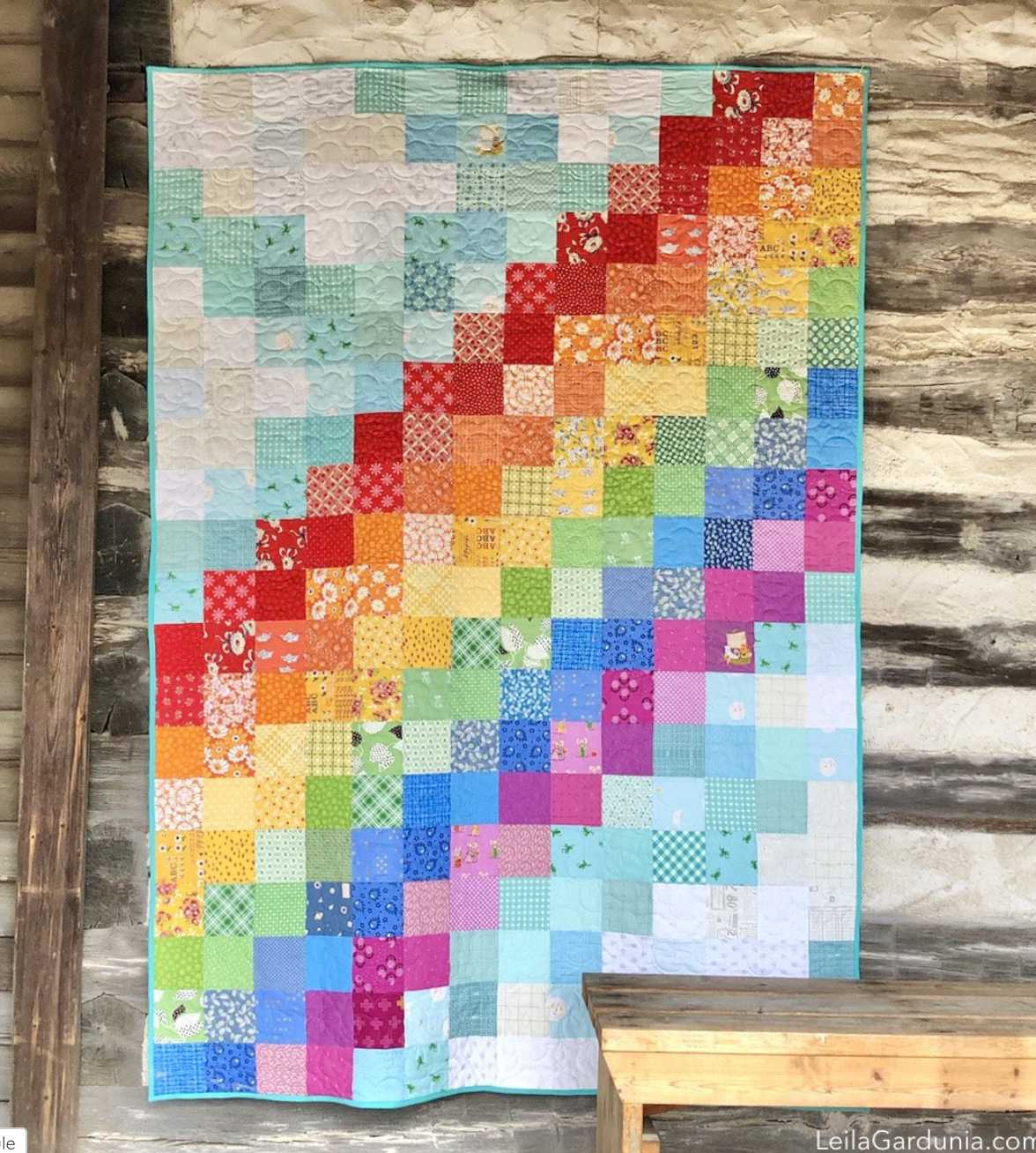
My design wall and the in-process Quilty Chicks quilt.
1. Fabric Value:
Fabric value refers to the relative lightness or darkness of a fabric. For example, the same medium blue fabric could be considered dark compared to a light yellow fabric or light compared to a deep plum fabric. Paying attention to the fabric values in your quilt can add depth and dimension. Here are a few ways you can use fabric value to elevate your quilt design:
Contrast: Choose fabrics that contrast to various degrees. Use the contrast (or lack of contrast) of light, medium, and dark fabrics to create visual interest. A light fabric next to a dark will really make the quilt design pop. But two fabrics with the same value will not have the same effect. You don’t want to spend lots of time making tiny fabric stars just to have the points disappear into the background fabric - unless you do. Sometimes a lack of contrast might be just what you want. I’ll give you an example of both.

The initial quilt design.

What I have so far. Checking the fabric values in black and white.
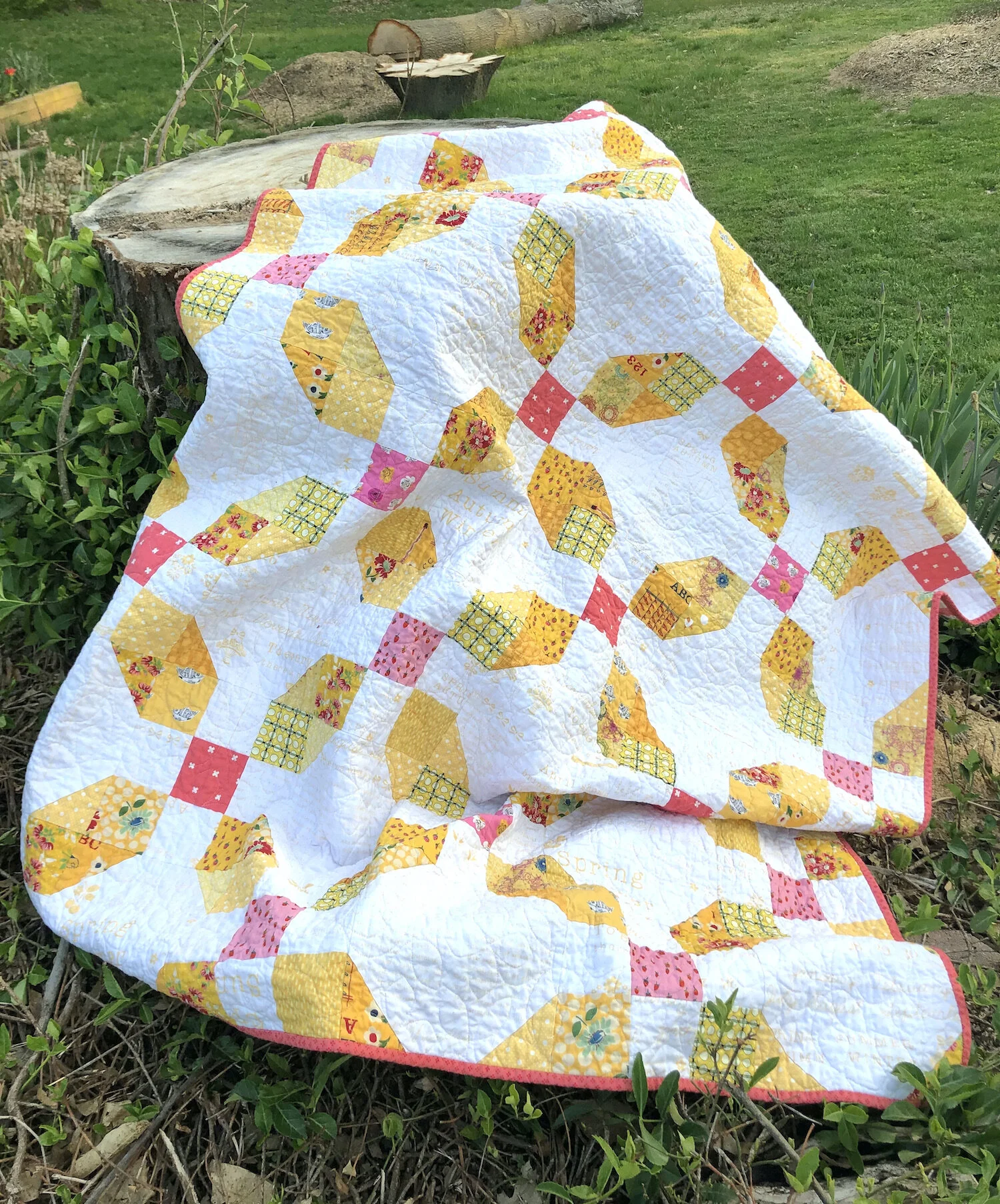
High contrast: This week I’ve been working on choosing fabric for my Quilty Chicks block of the month quilt. It features 14 chickens that have different quilt blocks on their sides. I want the colors in the chickens, flowers, and quilt block designs to look good together, but I also want to make sure the fabric I use for the quilt block design really pops. Large differences in value, a very light next to a very dark fabric, makes the block design easier to see and more striking. The white background will allow the chicken and flower blocks to really stand out, but spent a lot of time making sure there is contrast within the chicken blocks as well.
The first step to checking the fabric values in the Quilty Chicks quilt was to put my initial fabric pull on my design wall and make some common sense decisions about the general colors I wanted to use. Did the colors/fabrics look good together? Was there too much or too little of a color?
But most importantly was there a difference in value between the fabric for the chicken body and the interior quilt block? Sometimes this is easy to see. I knew there was enough contrast between the light yellow and medium blue fabrics, but some other fabric combos are more tricky. I double checked the fabric values by taking pictures of the design wall on my phone with the black and white filter on. If the fabric swatches were the same shade of gray, I would try another fabric combination until both the colors, prints, and value differences were perfect. (My sewing table looked like an explosion of fabric by the end of the process!)
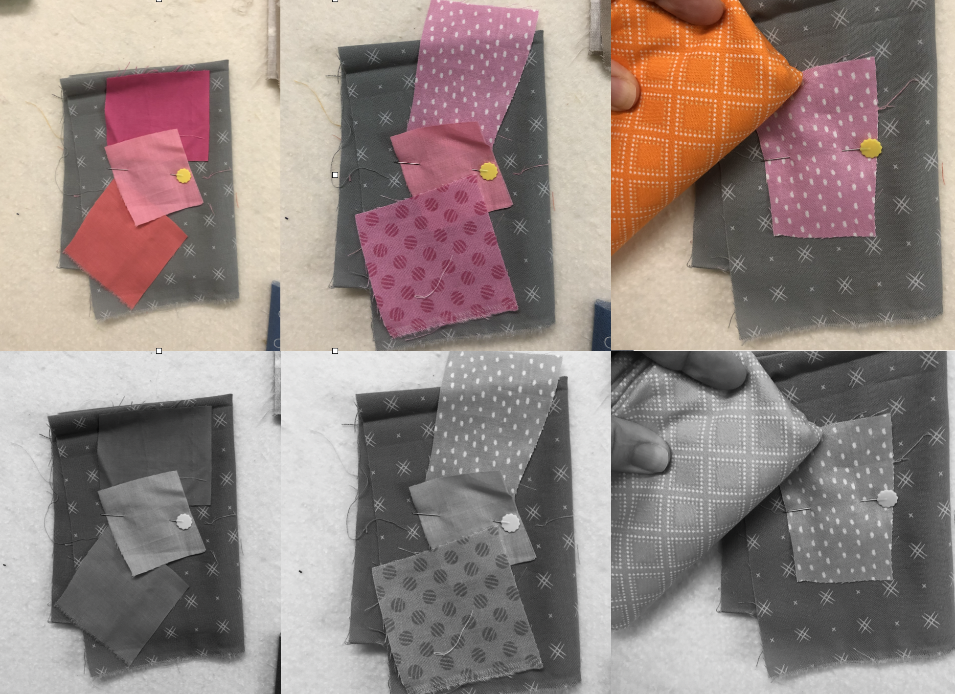
It was hard to find a contrasting quilt block fabric for the gray chicken fabric. It took quite a few tries to find a fabric I liked which also contrasted well. Here are a few of the many pictures I took during the process. :) I finally decided on the light purple dot.

The dark fabric in the center of the Patch Party quilt draws the eye.
Focal Points: Fabrics with high contrast values are also a great way to highlight focal points. The high contrast areas draw the eye and bring attention to that area of the quilt. My Patch Party quilt is a good example of this. The central star is definitely the focal point both because of it’s scale and because of the value difference between it and the rest of the quilt. Also note that the rest of the blocks use a light and dark value of the same color. If there wasn’t a difference in value within the block its design would be lost. Plus the solid white background lets all the blocks really pop. (Except the yellow… Most yellows are fairly light and generally don’t stand out as well against a light background. In this case, I thought keeping the rainbow intact was more important than the yellow block’s lack of contrast.)

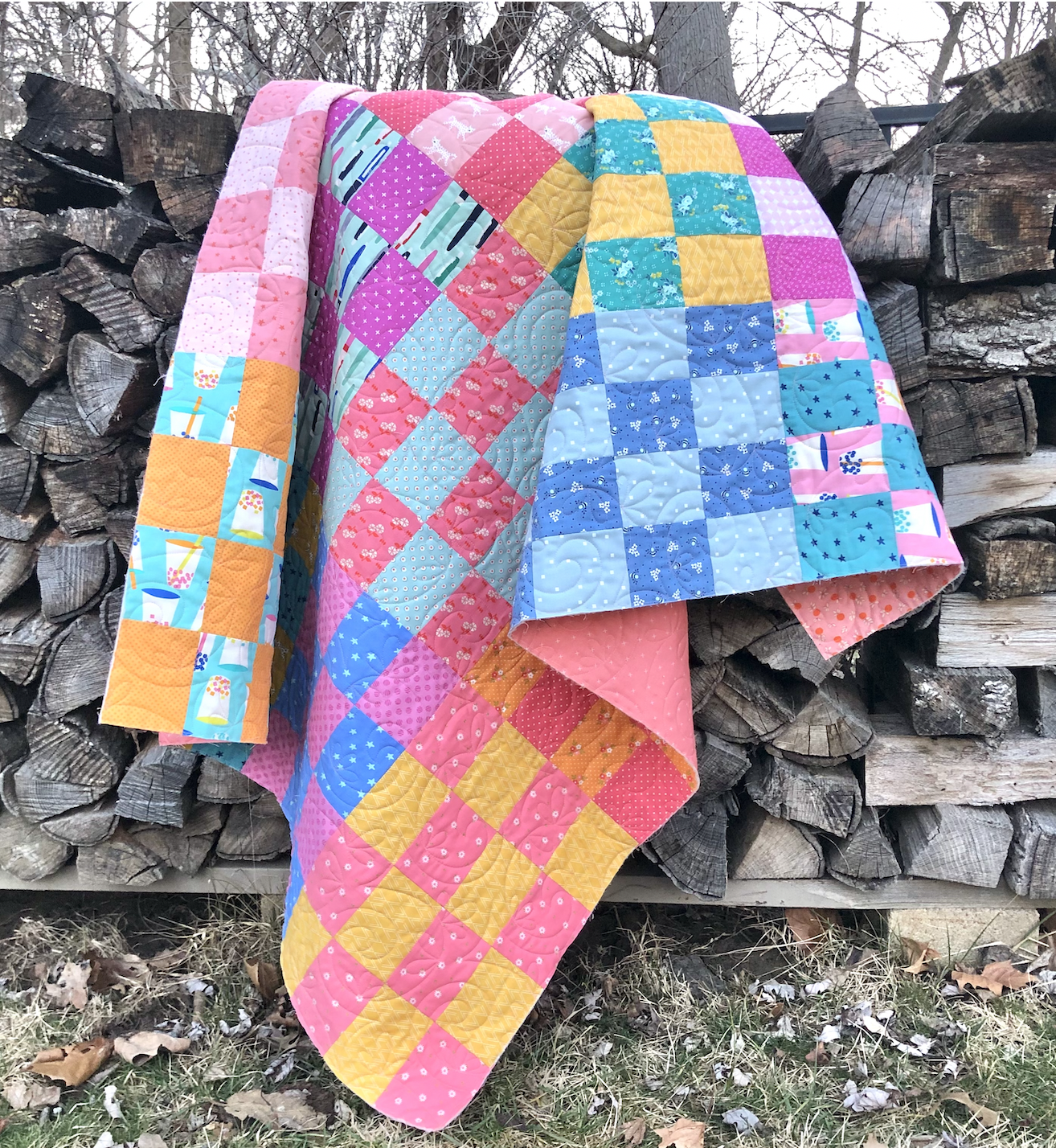
Low contrast scrap quilt.
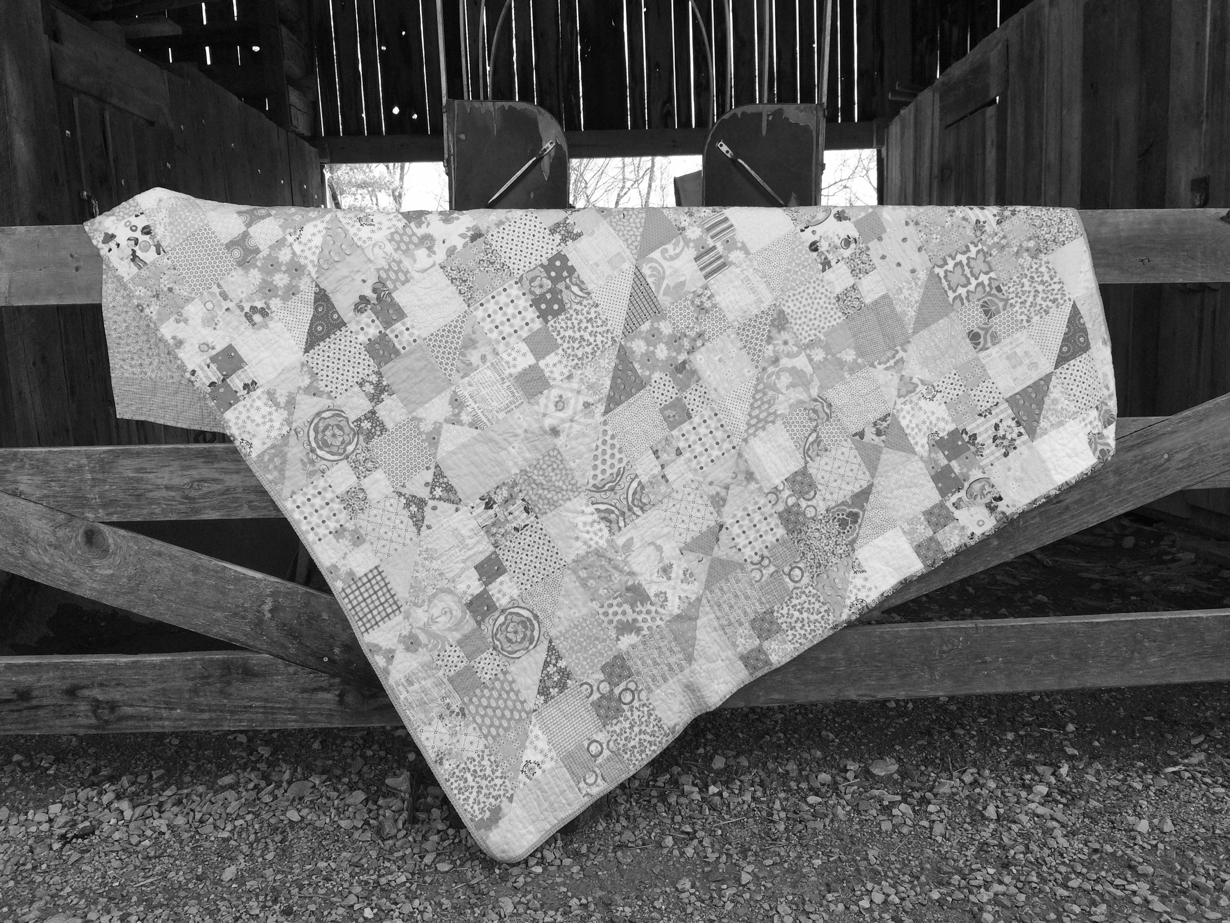
Even in black and white the contrast in fabric value is minimal.
Low Contrast: Sometimes you might not want a focal point or for your block design to stand out. Choosing low contrast fabrics is a valid design choice. One of my favorite quilts, and the one that lives on my bed, is low contrast. When seen in black and white there is a subtle diagonal design, but for the most part the 4-patch, half-square triangle, and quarter-square triangle units don’t stand out. Because your eye isn’t drawn to any particular place, the quilt has a cheerful, yet soft and relaxing feel.

The Hello, Geese! quilt is an example of value gradation or change.
Gradation: You can also gradually change the value of fabrics from one block to another. This creates a sense of movement and flow across the quilt. In my Hello, Geese! quilt each column of geese gets both gradually smaller and lighter in value. I like to think that the columns look like geese flying off into the distance.
2. Fabric Scale:
Fabric scale, the size of the images or patterns on the fabric, is another important thing to pay attention to when choosing fabric for a quilt. Large scale, small scale, and solid (no scale) fabrics each have their time and place. A general rule is that the smaller the block pieces are, the smaller the fabric scale should be. If the fabric scale is too large the edges of the fabric piece will not be clear and the overall design will be less distinct. I am too fond of prints and scrap quilts to use solids often, but I still want to make sure I can see the block design and that the quilt isn’t too busy. A great way to do this is to use small tone on tone prints. All of the fabrics in the Quilty Chicks quilt are very small scale. Small scale and solid fabrics don’t draw away from the quilt design.
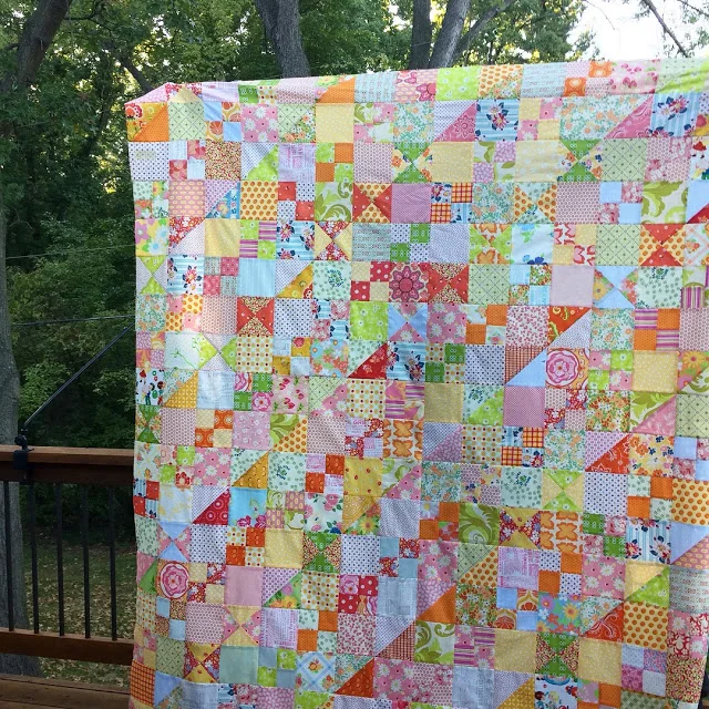
Scrap Happy Rainbow (quilted by Trace Creek Quilting)

Large prints do better with larger sized quilt pieces that celebrate the print and allow it to really shine. The larger squares in the Scrap Happy Rainbow quilt are perfect for larger prints. I really went to town on the baby quilt version and used all of my favorite large scale Heather Ross prints.
3. Fabric Placement:

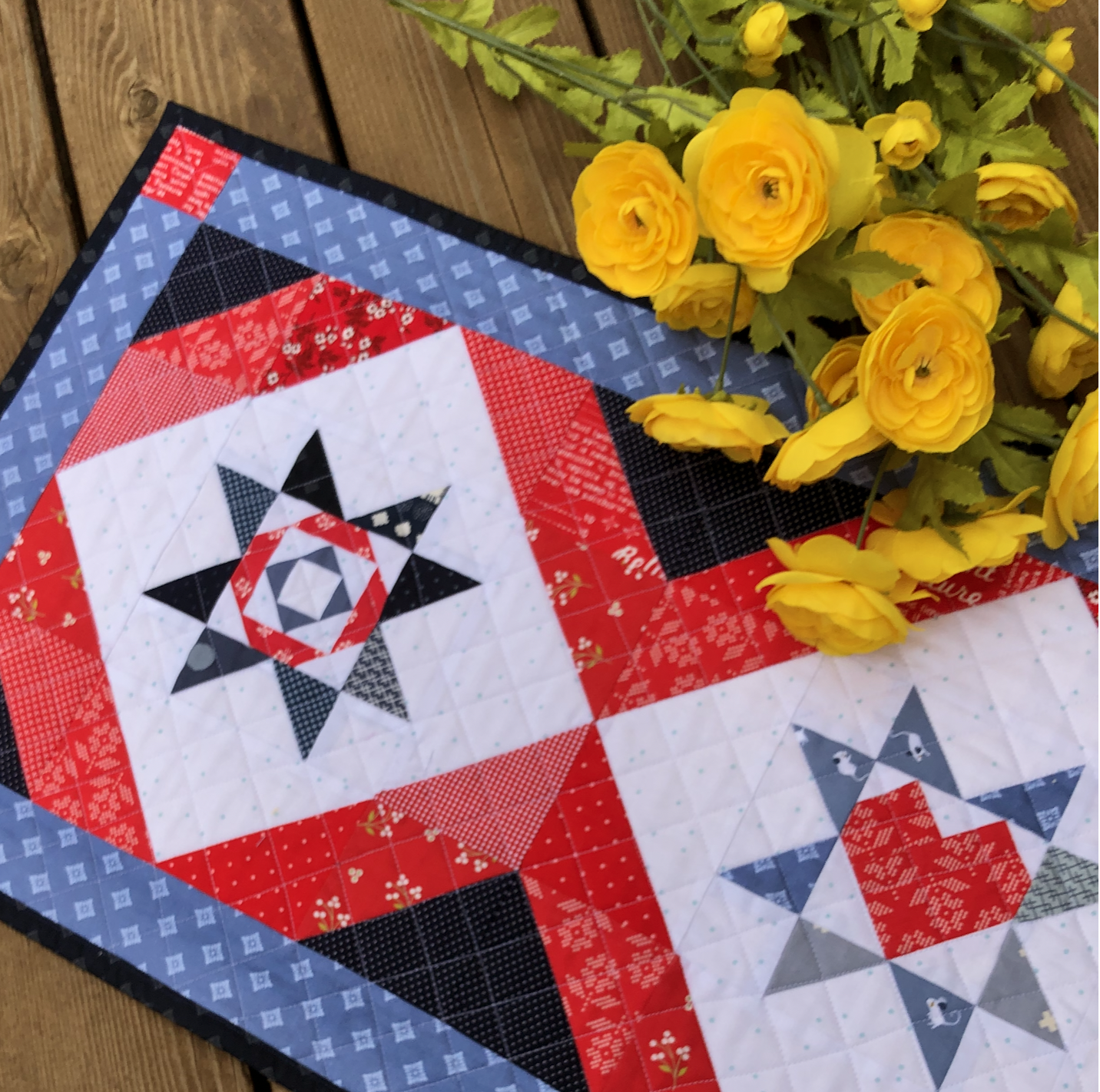
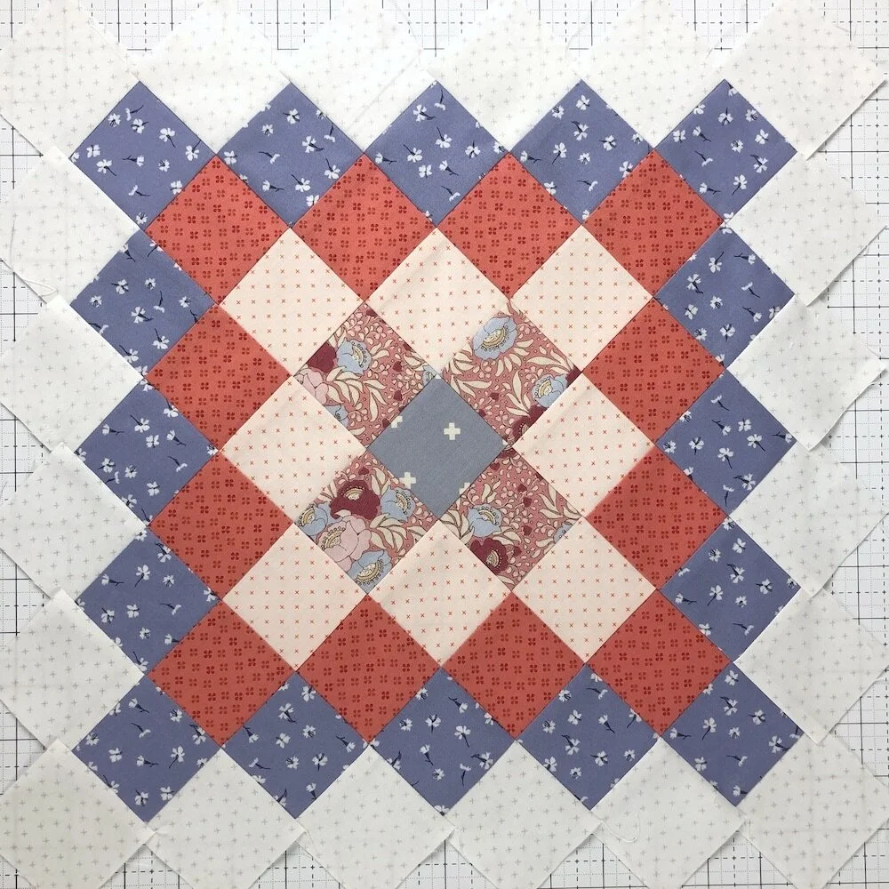
As a general rule, I like to distribute colors and prints fairly evenly across the entire quilt. The repetition of color and fabric across a quilt can give a quilt a balanced and cohesive look. The State Fair Sampler quilt is a good example. While each block uses just a few colors, the colors are repeated and balanced across the quilt.
I’ve spent quite a bit of time this week rearranging all the chicken fabric swatches on my design wall so the different colors and values of chickens and flowers are spread evenly across the quilt. Fabric placement is one of the reasons I decided to use that light purple dot fabric I talked about before. The light purple dot is also used in two flowers. Repeating the color and fabric in the chicken will help the quilt remain cohesive.
There are, of course, times you might wish to group colors and designs to increase the quilt’s impact and overall design.

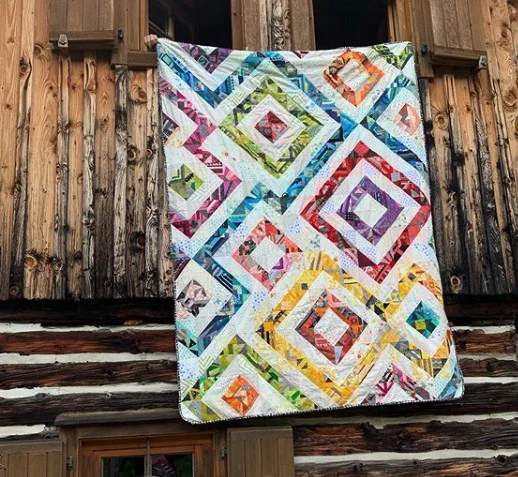
Grouping by color gives this quarter-square triangle quilt order and interest.

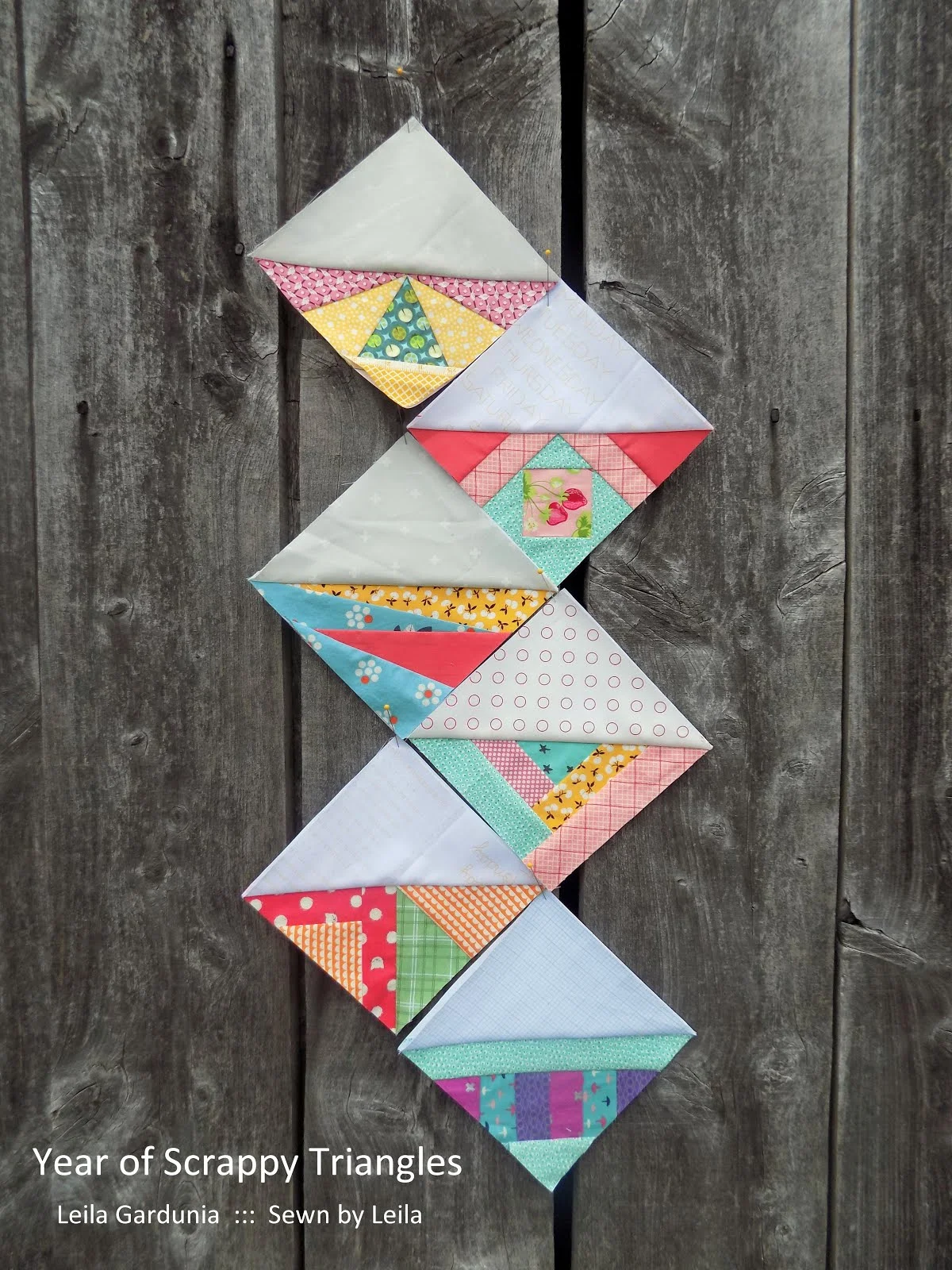
The Scrappy Triangles are roughly grouped by color.
When I made the large 9” quarter-square triangles (QST) for the quilt above I didn’t have a plan. I just made a bunch of QST and thought I’d throw them together into a scrap quilt. However, when I laid out all the blocks, it looked like a mess! I played with the QST for quite some time and found that ordering some of the QST by color and value added order and interest to the quilt. The vertical lines of green, yellow, and orange give the quilt a subtle dash of rainbow order and the dark blue horizontal lines (dark value contrasting fabric) add additional interest.
The same thing happened with my Scrappy Triangle quilt. I made a bunch of Scrappy Triangles, but when it came time to put them together my initial layout looked messy and visually overwhelming. I created some order and movement by arranging the triangles in a zig-zag pattern. In addition, I created some rough groupings by color. Using differences in value to create zig-zags and grouping some blocks by color made the quilt much more interesting and pleasant to look at.
Ideas for How to Play with Value, Scale, and Fabric Placement
The most important thing when designing a quilt is to take a few minutes to plan. You’ll notice I had problems with the last two quilts because I just started sewing without a plan. I don’t necessarily regret not planning because making the blocks was fun and relaxing, however, it did make the final layout decisions more complicated.
I recommend doing something that helps you visualize how the fabrics will look and interact with each other before cutting and sewing. You could make a sketch and color it or make a mock-up with computer software. This can help you see how different colors and values would interact. In my experience, making a sketch on paper is just the first step. Once I have an idea of the general colors and values I want to use, I have to pull out fabric and see how the colors and prints work together in real life. I cannot count the number of times I have changed my plan after seeing certain fabrics together.
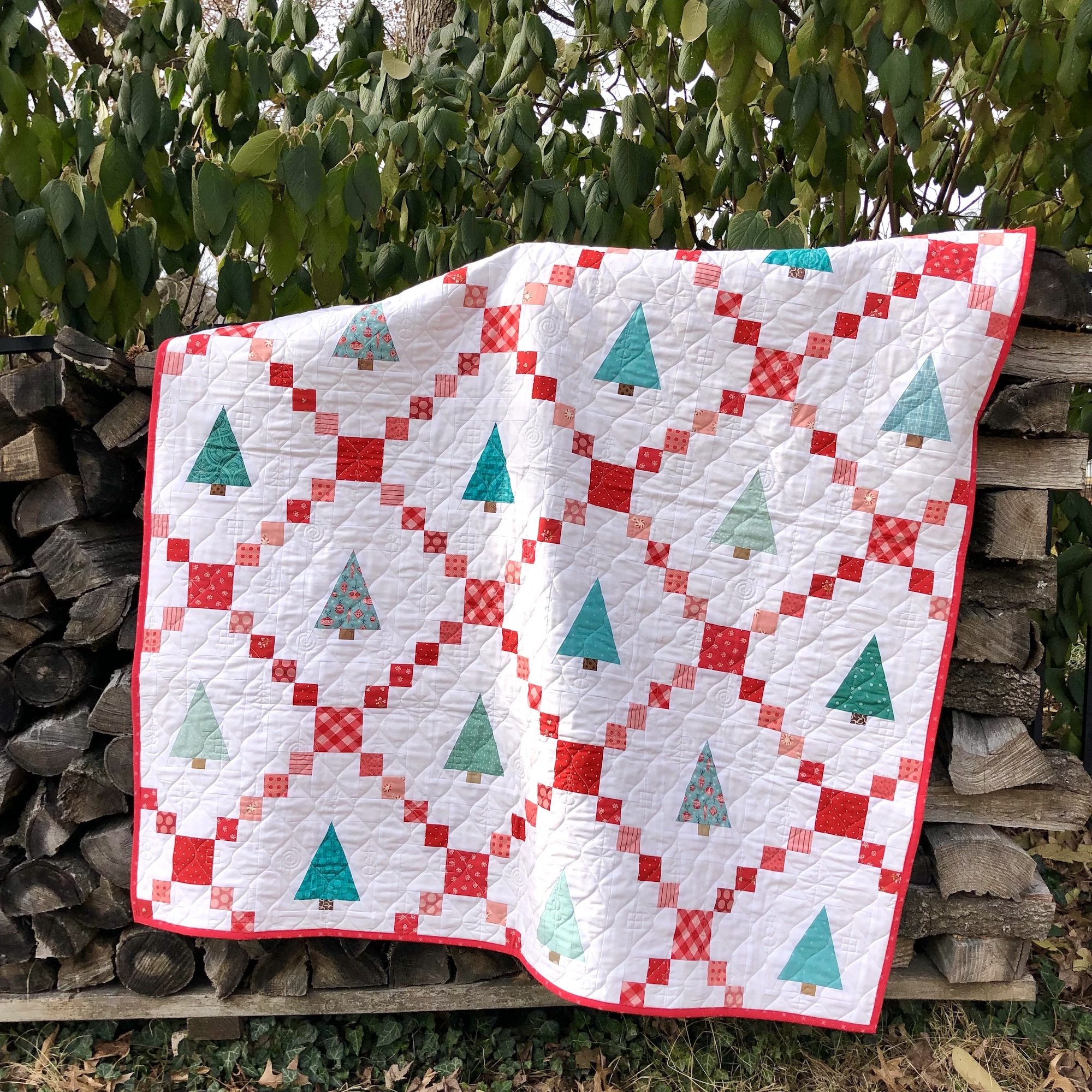
The Christmas Tree quilt in my Seasonally Scrappy pattern is a great example of when I changed plans mid quilt. I wanted to use bright, almost lime green, prints for my trees, but once I made my first tree block and put it next to the red chain blocks, I realized I didn’t like how it looked. It was fine… but it wasn’t the look I was going for. Instead, I decided to use aqua prints and loved how the quilt turned out! I spent a lot of time moving the trees around on my design wall so I had a sprinkling of each fabric throughout the quilt. However, I somehow failed to notice that I had placed two trees with the busiest print above and below each other until after I had bound the quilt. Sigh.
Which just goes to show that you can spend a ton of time thinking about value, placement, and scale and still make mistakes. But even with mistakes, the finished quilt is going to be beautiful! Be thoughtful about your quilt design, but don’t let overthinking leave you paralyzed and unable to make progress.
Keep experimenting with different fabric combinations and arrangements to find what works best for your quilt design. Over time, you'll develop an intuitive sense of how fabric value, scale, and placement interact and how to use them to best highlight your quilt design.
Additional Resources:
Tara Faughnan’s Value Creates the Design lecture. Tara is the master of using value in her quilts.
Choosing Fabric for a Quilt by Diary of a Quilter